
Express yourself with comments
How to quickly gather feedback on UI components and libraries
Developers spend an average of 72 minutes a day in meetings, chats, emails, comments, interrupts, and other communication. If you’re an experienced dev, you know how exhausting it can be to juggle feedback while developing UI. Change requests pile up causing details to slip through the cracks.
Collaboration is necessary because shipping UIs involves coordination across many disciplines. But it doesn’t have to be so taxing. I’m stoked to share new commenting workflows coming soon to Chromatic 2.0 (available in Early Access) that help you gather UI feedback faster with less work.
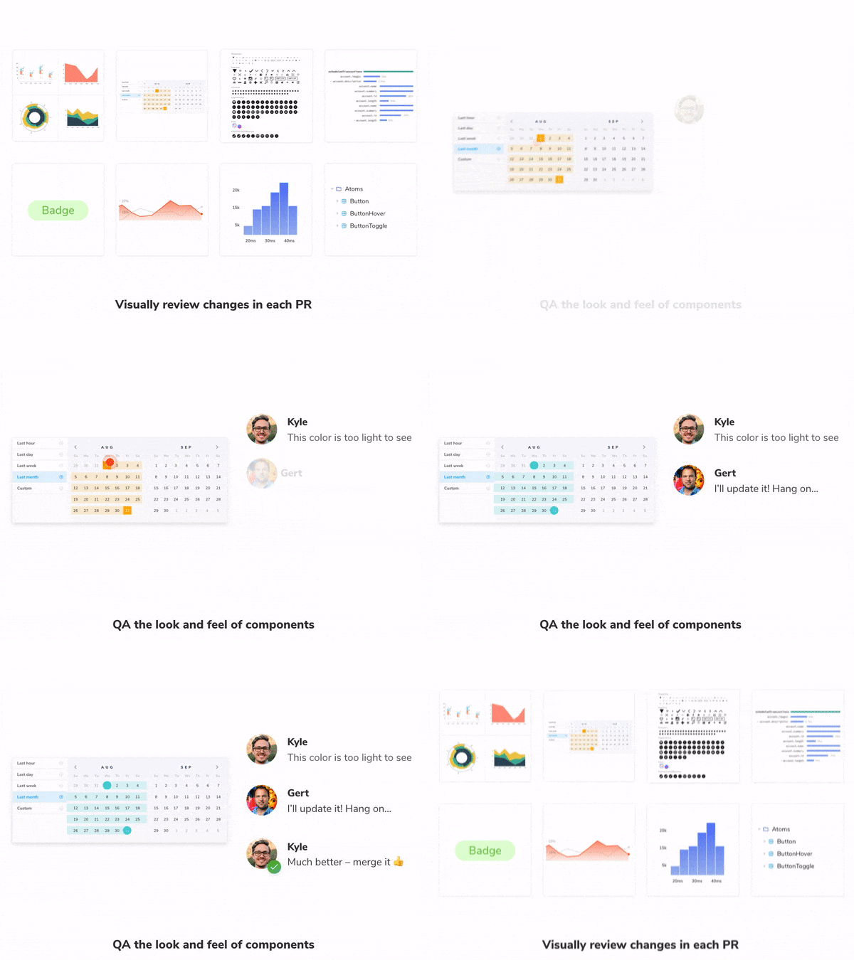
Get feedback alongside your UI implementation
Research-backed studies suggest that most problems in software development can be traced to lack of coordination. You’ve probably experienced that miscommunication during dev leads to throwaway work.
Most communication channels are too broad — they’re made for sharing memes and light discussion not UI development. Frontend teams debate in Slack channels or pollute Asana/Jira/Trello with trivialities. Pull requests are littered with screenshots and GIFs from outdated UI.
If discussion lived alongside the latest UI implementation you’d be able to track feedback and decision-making right where the UI library lives. Change requests would be listed in a single convenient place. What’s more, you’d have an ongoing paper trail of what UI changed, how, and why.
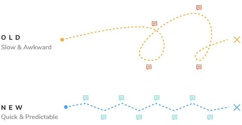
Collaboration in Chromatic
This feature is now available to Chromatic 2.0 Early Access users. It’s launching soon for all existing Chromatic customers.
With Chromatic gathering feedback is painless. Every time you push code your Storybook is published and versioned in our cloud. A PR badge will notify you that your component library is ready for feedback.

You’ll land on the pull request screen where the UI changes from your PR are visualized. Your team can compare the incoming UI from one branch to another. This helps PMs, tech leads, designers, and QA verify the look and feel of UIs in a glance.
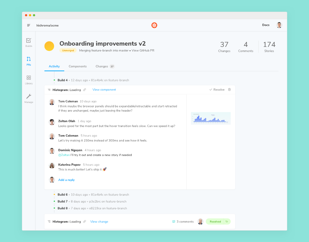
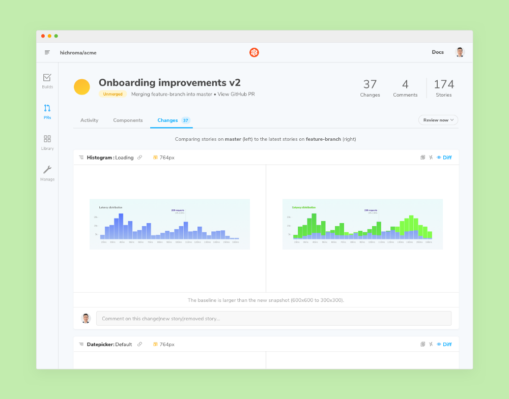
Start a discussion to request a change or ask questions. Comments and replies will be shown in situ next to the UI so all participants have the same reference point. That eliminates crosstalk and saves you from endlessly pasting screenshots with messages like “does this look right?”.
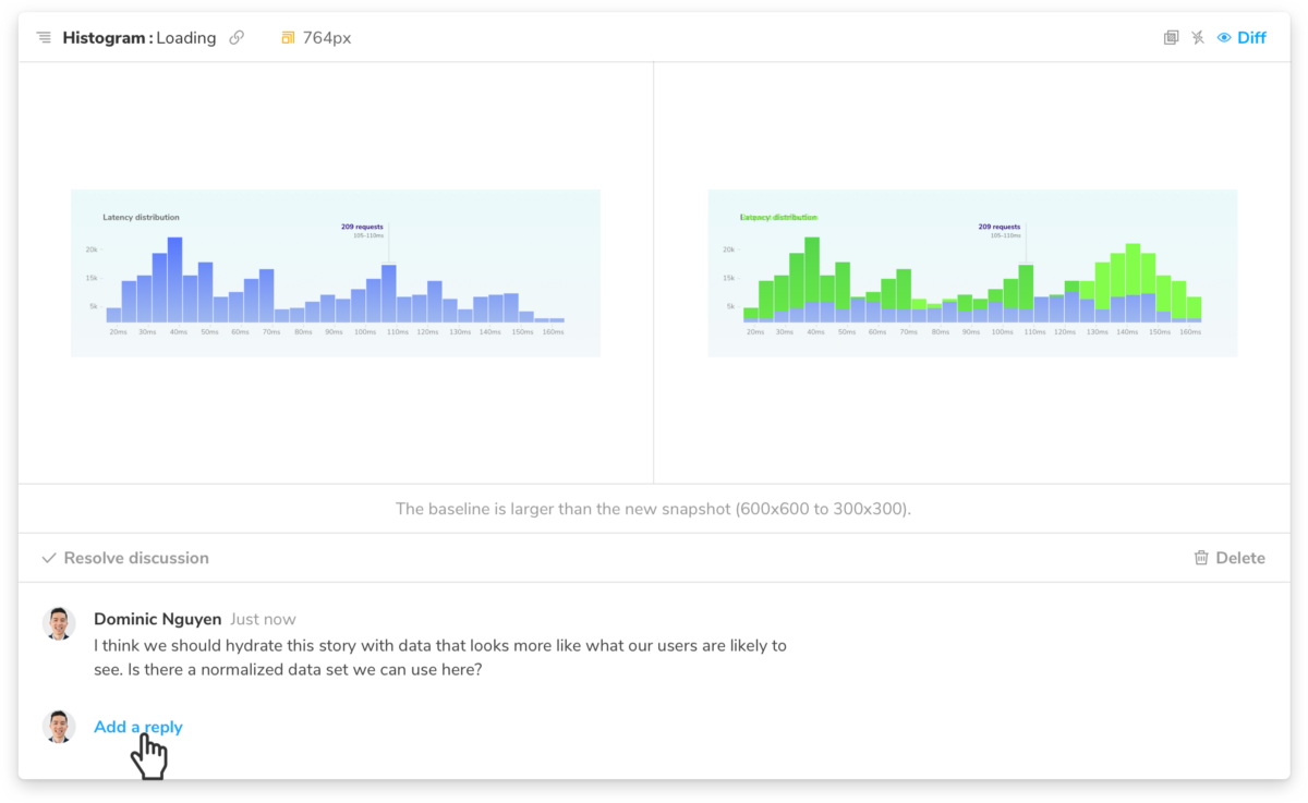
Want to verify the live component with the real rendered code? Click through to Chromatic’s component screen to see the fully inspectable, interactive UI. No spinning up a dev environment or pulling code.
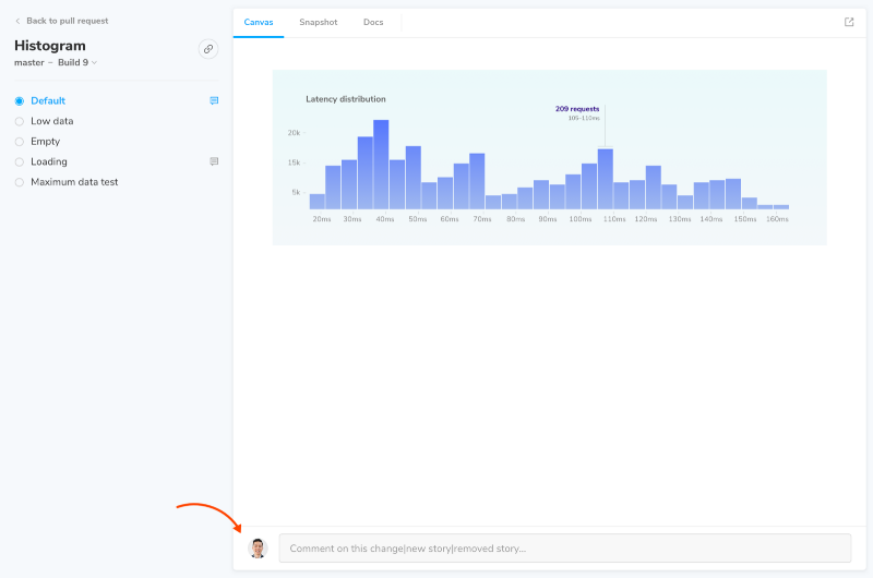
Share the link with a coworker to get a second opinion. Teammates can offer feedback right alongside the interactive component which saves everyone from typing out convoluted reproduction instructions or nuanced behaviors.
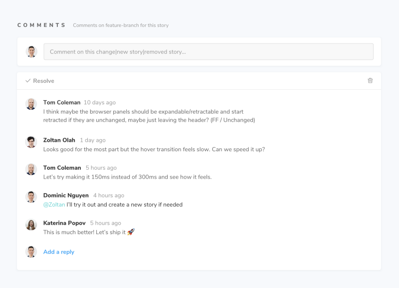
Once your team has completed visual review your PR check will turn green in GitHub, Bitbucket, or GitLab. You’re now ready to merge the UI!

What’s next?
Chromatic’s goal is to help you ship bulletproof UIs faster. So far we’ve done just that with our industrial-grade visual testing tool; it’s now used by Adobe, Workday, Auth0, and more.
But visual testing alone doesn’t solve every bug, there are many more that stem from miscommunication. Chromatic’s upcoming tools help teams gather clear continuous feedback during development. Comments are just the beginning.
Join us
- 🌍 Sign up for Chromatic 2.0 Early Access: A secure collaborative workspace for Storybook.
- ✅ Try Chromatic for free: Industrial-grade visual testing for component libraries and design systems. Used by Salesforce, Workday, Adobe, and more.